bunny cafe sf
Opening November 2025, the Bay Area’s first bunny cafe aims to carry on the legacy of Alex the Great, a Flemish Giant who served his San Francisco community & beyond as a therapy bunny, philanthropist, and community builder.
Their Story
Kei & Josh aim to honor and continue the selfless work of their Flemish Giant, Alex the Great (@Alex.TheGreat100) through the cafe by saving & fostering rabbits from kill shelters, raising and donating proceeds to foundations dedicated to rabbit rescue & care, and bringing together the community through this comforting safe haven.
The vegetarian cafe will serve Korean ramen, pastries, and drinks while offering visitors the opportunity to socialize and mingle amongst adoptable bunnies.
Brand Attributes
Calm
Offering a comfortable haven for adoptable bunnies and visitors alike
Fun
A space for bunnies & visitors near and far to enjoy, socialize, and mingle
Community-oriented
Continuing Alex’s work of bringing the community together while raising awareness & funding for community causes
Soft/Light
Evoking a sense of lightness and serenity
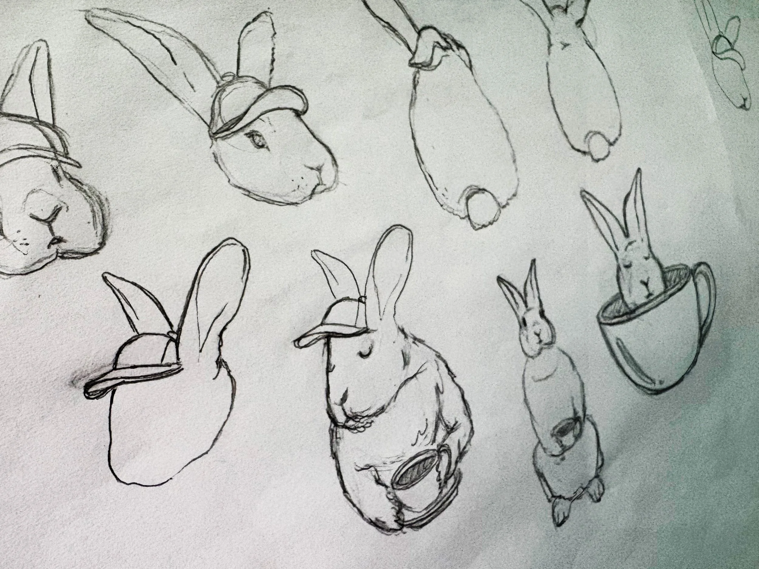
The cafe’s logo features Alex the Great and his signature look. As the official rally rabbit for the San Francisco Giants—who attended many games and once threw the opening pitch—he sports an orange hat representing his hometown and the community he served.
Variable stroke widths of the design offer a handcrafted quality adding character and charm which leans into the community-forward approach that the cafe embodies.
While honoring Alex and his legacy, the design also strikes a balance between a sense of calm and fun—key attributes of the cafe and brand.
The Logo Story

Brand colors
As the face of the cafe, Alex’s tan coat and orange hat are featured in the brand’s logo, representing his loyalty to the SF Giants.
An expanded color palette includes pastel mint and lilac to accompany the colors within the logo. The vibrant, yet soft, palette strikes the perfect balance between a calm yet playful energy, which Kei and Josh describe as important attributes of the overarching brand.
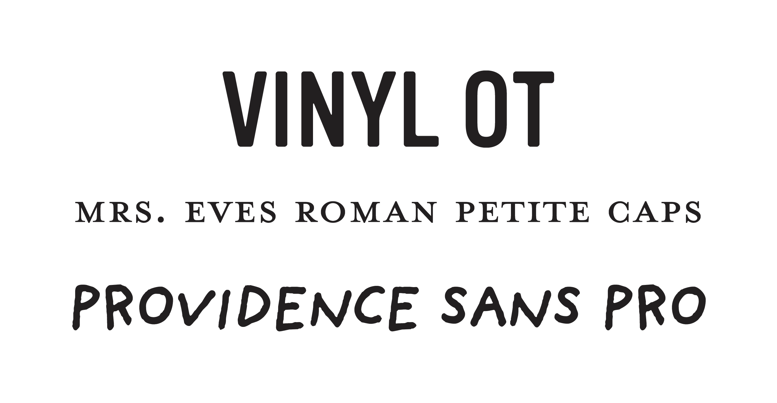
typography
Vinyl OT is the typeface for the cafe’s name, providing a clean and simple contrast to the handcrafted qualities of the mascot. Additionally, Mrs. Eves Roman Petite Caps is the typeface used for San Francisco—with the serifs contrasting the san serif Vinyl OT.
Providence Sans Pro will be used throughout the brand. The handwritten quality works in harmony with the hand drawn style of the bunny, further adding a playful charm throughout.
supporting graphics
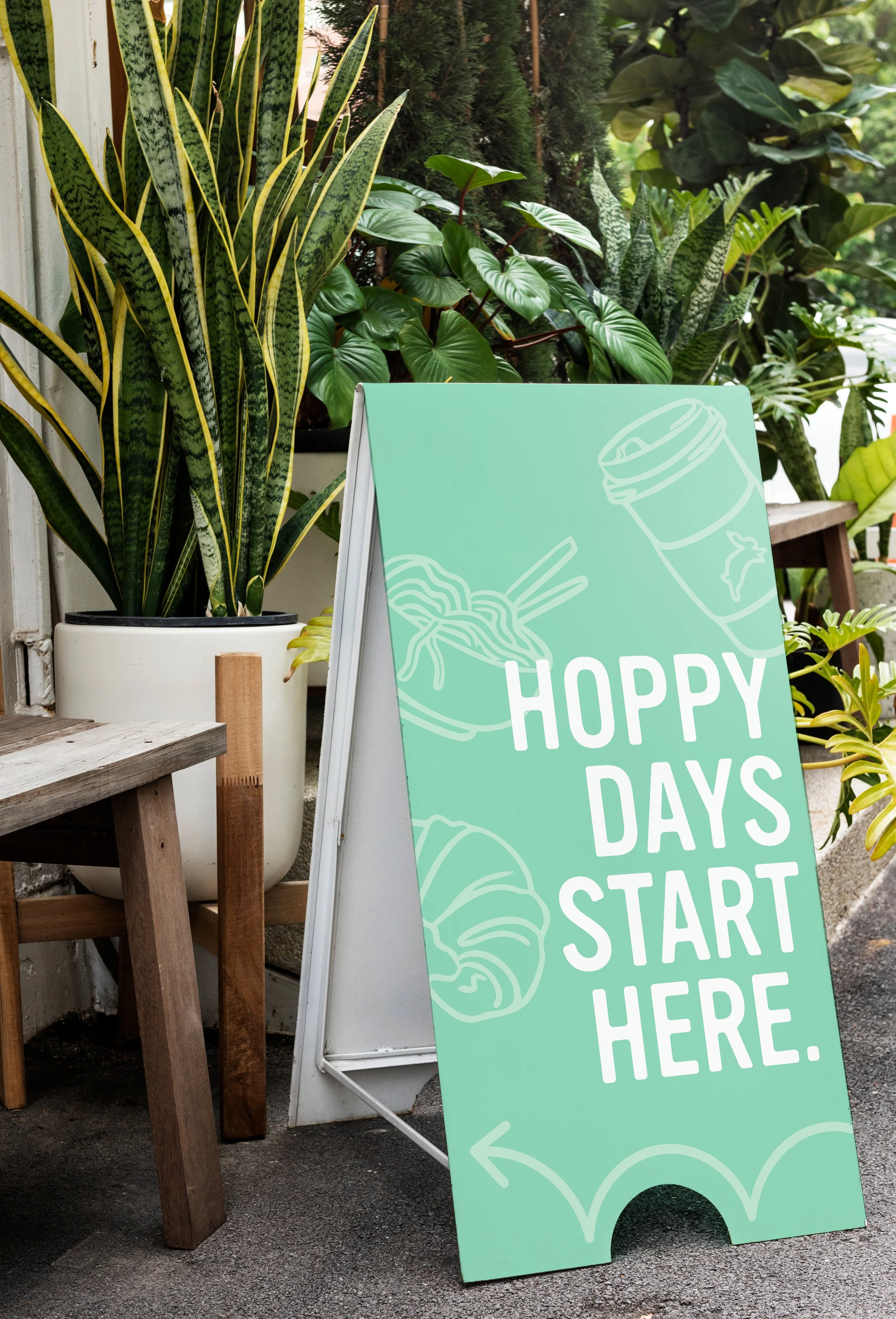
Hand drawn graphics of menu items, Alex the Great memorabilia, and Bay Area charm add visual depth to the brand. The graphics match the style of the cafe’s logo creating visual harmony across the brand identity.
They’re versatile enough to be used as standalone icons or as a repeatable pattern for a variety of uses from wallpaper, to visual assets for a branded menu and merchandise design.